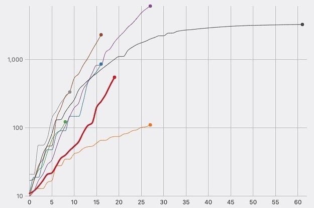
Experts don’t yet have a full explanation, but the age breakdown of countries’ populations and their capacity to deliver care to critically ill people will be crucial in the coming weeks and months.
Source: These Charts Help Explain Why The Coronavirus Has Been More Deadly In Certain Countries


